
从零开始打造前端低代码平台:原理 + 实现 + 可运行 Demo 全解析
button><input>低代码 = 拖拽 + 配置 + 渲染👉 最终生成的是一个 JSON(我们称为 schema),页面长什么样全靠它。
·
1. 什么是低代码?
- 传统开发:每个按钮、输入框都要你写
<button>、<input>。 - 低代码:这些东西你“拖一拖、点一点”就自动生成了,背后全靠配置。
低代码 = 拖拽 + 配置 + 渲染
👉 最终生成的是一个 JSON(我们称为 schema),页面长什么样全靠它
2. 低代码平台长什么样?
┌────────────┐   ┌─────────────┐   ┌──────────────┐
│ 组件面板   │ → │   画布区     │ → │  属性设置面板  │
└────────────┘   └─────────────┘   └──────────────┘
                     ↓
                 输出 JSON schema
你拖拽组件 → 页面更新 → schema 更新 → 可以导出 schema 存储/渲染
3. 目标
打造一个迷你低代码编辑器,有以下功能:
- 拖拽组件到页面上(比如按钮、输入框)
- 点击组件后右侧可以配置它的属性
- 页面实时更新、支持导出 JSON 数据
4. 技术栈一览(都是好上手的)
- React + TypeScript:基础框架
- Zustand:比 Redux 轻的状态管理
- react-dnd:实现拖拽
- Tailwind CSS:快速写样式(可换)
4.1 第一步:搭建状态管理 —— 用 schema 管整个页面
我们需要一个地方来统一管理页面上的“组件树”,以及哪个组件被选中了。这个“组件树”其实就是 schema(页面描述用的 JSON)。
- schema:页面的“数据快照”,决定了 UI 的结构。
- DSL(领域特定语言):这里指的是我们定义页面结构的“格式”。
代码:store.ts
import { create } from "zustand";

// 定义一个组件节点的结构
interface Node {
  id: string;                      // 每个组件唯一标识
  type: string;                    // 组件类型,比如 input、button
  props: Record<string, any>;      // 组件的属性,比如 placeholder、text
}

// Zustand 状态仓库的结构
interface Store {
  schema: Node[];                  // 当前页面的所有组件(线性列表)
  selectedId: string | null;      // 当前被选中的组件 id
  addNode: (node: Node) => void;  // 添加新组件到 schema
  updateProps: (id: string, props: Record<string, any>) => void; // 修改属性
  selectNode: (id: string) => void; // 选中某个组件
}

// 创建 Zustand store
export const useSchemaStore = create<Store>((set) => ({
  schema: [],
  selectedId: null,
  addNode: (node) =>
    set((s) => ({
      schema: [...s.schema, node], // 添加一个组件到页面
    })),
  updateProps: (id, newProps) =>
    set((s) => ({
      schema: s.schema.map((n) =>
        n.id === id
          ? { ...n, props: { ...n.props, ...newProps } }
          : n
      ), // 更新指定组件的属性
    })),
  selectNode: (id) => set({ selectedId: id }), // 记录当前选中的组件
}));
4.2 第二步:组件库 - 拖拽组件到画布中
低代码的入口就是“我能选什么组件拖进去”。所以我们要提供一个组件面板,支持拖拽。
代码:ComponentPanel.tsx
export const ComponentPanel = () => {
  const components = [
    { type: "input", label: "输入框", defaultProps: { placeholder: "请输入" } },
    { type: "button", label: "按钮", defaultProps: { text: "点击我" } },
  ];

  return (
    <div className="p-2 border-r w-40">
      {components.map((comp) => (
        <div
          key={comp.type}
          draggable
          onDragStart={(e) =>
            e.dataTransfer.setData("component", JSON.stringify(comp))
          }
          className="cursor-move bg-gray-100 p-2 my-1 rounded text-center"
        >
          {comp.label}
        </div>
      ))}
    </div>
  );
};
- 使用
dataTransfer.setData可以把组件的信息存起来,拖放时读取。 - 每个组件都有默认属性(defaultProps),比如按钮的文字。
4.3 第三步:画布区 - 拖进来的组件要能“显示”出来
你拖了个组件进来,它必须渲染出来,这就需要写一个 Renderer(渲染器)去读取 schema,并把组件一一画出来。
代码:Renderer.tsx
import { useSchemaStore } from "./store";

export const Renderer = () => {
  const { schema, selectNode, selectedId } = useSchemaStore();

  return (
    <div
      className="p-4 min-h-64 border"
      onDragOver={(e) => e.preventDefault()}
      onDrop={(e) => {
        const data = e.dataTransfer.getData("component");
        if (data) {
          const { type, defaultProps } = JSON.parse(data);
          useSchemaStore.getState().addNode({
            id: Math.random().toString(36).slice(2),
            type,
            props: defaultProps,
          });
        }
      }}
    >
      {schema.map((node) => {
        const isSelected = node.id === selectedId;
        const commonProps = {
          className: `p-2 border mb-2 cursor-pointer ${isSelected ? "bg-blue-100" : ""}`,
          onClick: () => selectNode(node.id),
        };

        if (node.type === "input") {
          return <input key={node.id} {...node.props} {...commonProps} />;
        }
        if (node.type === "button") {
          return (
            <button key={node.id} {...commonProps}>
              {node.props.text}
            </button>
          );
        }
        return null;
      })}
    </div>
  );
};
- 使用
onDrop把组件拖进来后加入 schema。 - 使用
schema.map()渲染所有组件。 - 支持点击后高亮选中,配合属性面板使用。
4.4 第四步:属性面板 - 改变组件的配置
组件拖进来之后,我们要支持“改属性”——比如把按钮改成“提交表单”,或者输入框加 placeholder。
代码:ConfigPanel.tsx
import { useSchemaStore } from "./store";

export const ConfigPanel = () => {
  const { schema, selectedId, updateProps } = useSchemaStore();
  const selectedNode = schema.find((n) => n.id === selectedId);
  if (!selectedNode) return <div className="p-2">未选择组件</div>;

  const onChange = (key: string, value: string) => {
    updateProps(selectedNode.id, { [key]: value });
  };

  return (
    <div className="p-2 w-60 border-l">
      <h3 className="font-bold mb-2">属性面板</h3>
      {selectedNode.type === "input" && (
        <input
          className="border p-1 w-full"
          value={selectedNode.props.placeholder || ""}
          onChange={(e) => onChange("placeholder", e.target.value)}
        />
      )}
      {selectedNode.type === "button" && (
        <input
          className="border p-1 w-full"
          value={selectedNode.props.text || ""}
          onChange={(e) => onChange("text", e.target.value)}
        />
      )}
    </div>
  );
};
属性修改其实是改 store 里的 schema,然后组件就自动更新了。
4.5 第五步:组合一切 - 主入口 App.tsx
需要一个页面把左边组件区、中间画布、右边属性面板都拼起来。
代码:App.tsx
import { ComponentPanel } from "./ComponentPanel";
import { Renderer } from "./Renderer";
import { ConfigPanel } from "./ConfigPanel";
import { useSchemaStore } from "./store";

function App() {
  const { schema } = useSchemaStore();

  return (
    <div className="flex h-screen font-sans text-sm">
      <ComponentPanel />
      <div className="flex-1 p-2">
        <h2 className="text-lg font-bold mb-2">画布区</h2>
        <Renderer />
        <button
          className="mt-4 bg-blue-500 text-white px-3 py-1 rounded"
          onClick={() => alert(JSON.stringify(schema, null, 2))}
        >
          导出 Schema
        </button>
      </div>
      <ConfigPanel />
    </div>
  );
}

export default App;
4.6 第六步:导出 schema
点击“导出 Schema”按钮,我们会把当前页面的 schema 打印出来,你可以存数据库、生成代码,或者部署。
示例输出:
[
  {
    "id": "abc123",
    "type": "input",
    "props": {
      "placeholder": "请输入用户名"
    }
  },
  {
    "id": "def456",
    "type": "button",
    "props": {
      "text": "提交"
    }
  }
]
附带css代码
body, html, #root {
  margin: 0;
  height: 100%;
  font-family: Arial, sans-serif;
}

.flex {
  display: flex;
}

.border {
  border: 1px solid #ddd;
}

.p-2 {
  padding: 8px;
}

.p-4 {
  padding: 16px;
}

.w-40 {
  width: 160px;
}

.w-60 {
  width: 240px;
}

.cursor-move {
  cursor: move;
}

.cursor-pointer {
  cursor: pointer;
}

.bg-gray-100 {
  background-color: #f5f5f5;
}

.bg-blue-100 {
  background-color: #d0e7ff;
}

.bg-blue-500 {
  background-color: #007bff;
  color: white;
}

.rounded {
  border-radius: 4px;
}

.mb-2 {
  margin-bottom: 8px;
}

.my-1 {
  margin-top: 4px;
  margin-bottom: 4px;
}

.text-center {
  text-align: center;
}

.text-lg {
  font-size: 1.125rem;
}

.font-bold {
  font-weight: bold;
}

.flex-1 {
  flex: 1;
}

.min-h-64 {
  min-height: 256px;
}

.mt-4 {
  margin-top: 16px;
}

input, button {
  font-size: 14px;
  box-sizing: border-box;
}

input {
  width: 100%;
}

button {
  padding: 8px 12px;
  border: none;
}
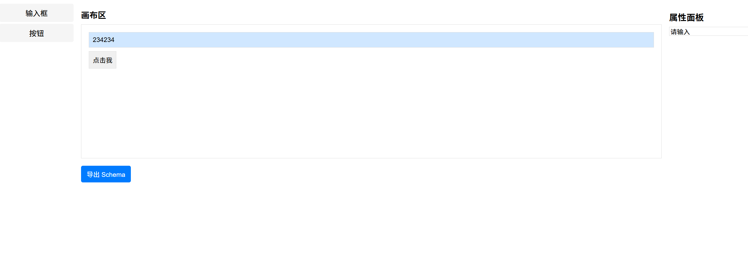
最终效果图展示

一站式 AI 云服务平台
更多推荐


 26
26 0
0- 0


 已为社区贡献1条内容

所有评论(0)