
设计系统中的 Motion Token 体系:动画节奏的标准化与跨端一致性
设计系统中的 Motion Token 体系:动画节奏的标准化与跨端一致性
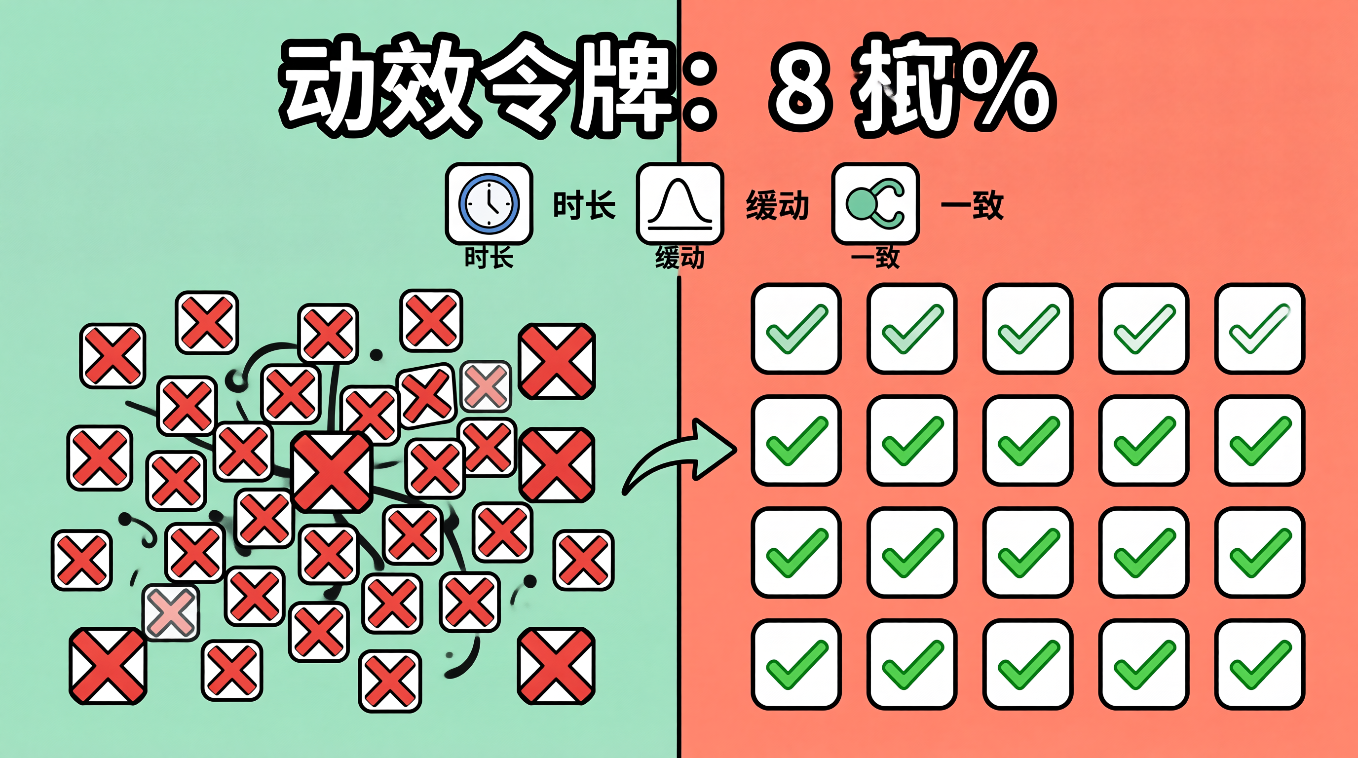
一、动画参数的"散落困境":设计系统的动效一致性问题
设计系统通过 Design Token 实现了颜色、间距、字体的标准化,但动画参数(时长、缓动曲线、延迟)往往散落在各组件的 CSS/代码中。一个按钮的 hover 过渡是 0.2s ease,另一个是 0.3s ease-in-out;一个模态框的入场是 0.3s,另一个是 0.25s——这些微小的差异累积起来,让产品的动效节奏显得零散而不专业。
Motion Token 的目标是将动画参数标准化为设计令牌,与颜色、间距 Token 同等对待。通过定义统一的时长阶梯、缓动曲线库和动画预设,确保全产品的动效节奏一致,并支持跨端(Web/Flutter/React Native)同步。
二、Motion Token 的体系架构
flowchart TD
    A[Motion Token 体系] --> B[时长阶梯: Duration Scale]
    A --> C[缓动曲线库: Easing Library]
    A --> D[动画预设: Motion Presets]
    B --> B1[instant: 0ms]
    B --> B2[fast: 100ms]
    B --> B3[normal: 200ms]
    B --> B4[slow: 350ms]
    B --> B5[slower: 500ms]
    C --> C1[standard: cubic-bezier(0.4, 0, 0.2, 1)]
    C --> C2[decelerate: cubic-bezier(0, 0, 0.2, 1)]
    C --> C3[accelerate: cubic-bezier(0.4, 0, 1, 1)]
    C --> C4[sharp: cubic-bezier(0.4, 0, 0.6, 1)]
    D --> D1[fade-in: opacity 0→1, normal, standard]
    D --> D2[slide-up: translateY(8px)→0, slow, decelerate]
    D --> D3[scale-in: scale(0.95)→1, fast, standard]
    D --> D4[expand: height 0→auto, slow, decelerate]
三、Motion Token 的代码实现
3.1 Token 定义与 CSS 变量输出
/* ===== Motion Token: 时长阶梯 ===== */
:root {
  /* 时长阶梯:基于 100ms 基数的等比数列 */
  --motion-duration-instant: 0ms;
  --motion-duration-fast: 100ms;
  --motion-duration-normal: 200ms;
  --motion-duration-moderate: 300ms;
  --motion-duration-slow: 400ms;
  --motion-duration-slower: 600ms;

  /* 缓动曲线:Material Design 3 标准 */
  --motion-easing-standard: cubic-bezier(0.2, 0, 0, 1);     /* 通用过渡 */
  --motion-easing-decelerate: cubic-bezier(0, 0, 0, 1);     /* 入场动画 */
  --motion-easing-accelerate: cubic-bezier(0.3, 0, 1, 1);   /* 退场动画 */
  --motion-easing-sharp: cubic-bezier(0.4, 0, 0.6, 1);      /* 即时反馈 */

  /* 动画预设:组合时长 + 缓动 */
  --motion-preset-fade: var(--motion-duration-normal) var(--motion-easing-standard);
  --motion-preset-slide: var(--motion-duration-slow) var(--motion-easing-decelerate);
  --motion-preset-scale: var(--motion-duration-fast) var(--motion-easing-standard);
  --motion-preset-expand: var(--motion-duration-slow) var(--motion-easing-decelerate);
}

/* ===== 减弱动画偏好 ===== */
@media (prefers-reduced-motion: reduce) {
  :root {
    --motion-duration-instant: 0ms;
    --motion-duration-fast: 0ms;
    --motion-duration-normal: 0ms;
    --motion-duration-moderate: 0ms;
    --motion-duration-slow: 0ms;
    --motion-duration-slower: 0ms;
  }
}
3.2 组件中的 Motion Token 使用
/* 按钮 hover 过渡 */
.button {
  transition:
    background-color var(--motion-preset-fade),
    transform var(--motion-preset-scale),
    box-shadow var(--motion-preset-fade);
}

.button:hover {
  transform: scale(1.02);
  box-shadow: var(--shadow-md);
}

.button:active {
  transform: scale(0.98);
  transition-duration: var(--motion-duration-fast);
}

/* 模态框入场 */
.modal-overlay {
  transition: opacity var(--motion-preset-fade);
}

.modal-content {
  transition:
    opacity var(--motion-preset-fade),
    transform var(--motion-preset-slide);
}

.modal-overlay[data-state="open"] .modal-content {
  opacity: 1;
  transform: translateY(0);
}

.modal-overlay[data-state="closed"] .modal-content {
  opacity: 0;
  transform: translateY(8px);
}

/* Toast 通知 */
.toast {
  animation: toast-in var(--motion-duration-slow) var(--motion-easing-decelerate) forwards;
}

.toast[data-state="closed"] {
  animation: toast-out var(--motion-duration-moderate) var(--motion-easing-accelerate) forwards;
}

@keyframes toast-in {
  from { opacity: 0; transform: translateY(-12px) scale(0.96); }
  to { opacity: 1; transform: translateY(0) scale(1); }
}

@keyframes toast-out {
  from { opacity: 1; transform: translateY(0) scale(1); }
  to { opacity: 0; transform: translateY(-12px) scale(0.96); }
}
3.3 跨端 Token 同步:Flutter
class MotionTokens {
  // 时长阶梯
  static const Duration instant = Duration.zero;
  static const Duration fast = Duration(milliseconds: 100);
  static const Duration normal = Duration(milliseconds: 200);
  static const Duration moderate = Duration(milliseconds: 300);
  static const Duration slow = Duration(milliseconds: 400);
  static const Duration slower = Duration(milliseconds: 600);

  // 缓动曲线
  static const Curve standard = Curves.easeInOutCubicEmphasized;
  static const Curve decelerate = Curves.easeOutCubic;
  static const Curve accelerate = Curves.easeInCubic;
  static const Curve sharp = Curves.easeInOut;

  // 动画预设
  static AnimatedSwitcherTransitionBuilder fadeTransition =
    (Widget child, Animation<double> animation) {
      return FadeTransition(
        opacity: animation,
        child: child,
      );
    };

  static AnimatedSwitcherTransitionBuilder slideUpTransition =
    (Widget child, Animation<double> animation) {
      return SlideTransition(
        position: Tween<Offset>(
          begin: Offset(0, 0.05),
          end: Offset.zero,
        ).animate(CurvedAnimation(
          parent: animation,
          curve: decelerate,
        )),
        child: child,
      );
    };
}
3.4 Token 同步工具
/**
 * Motion Token 同步器:从 CSS 变量生成 Flutter/React Native 代码
 * 确保跨端动画参数一致
 */
class MotionTokenSync {
  private tokens: Map<string, string>;

  constructor(cssFilePath: string) {
    this.tokens = this.parseCSSTokens(cssFilePath);
  }

  /**
   * 生成 Flutter MotionTokens 类
   */
  generateFlutter(): string {
    const durations = [...this.tokens.entries()]
      .filter(([key]) => key.startsWith('--motion-duration-'))
      .map(([key, value]) => {
        const name = key.replace('--motion-duration-', '');
        const ms = parseInt(value);
        return `  static const Duration ${name} = Duration(milliseconds: ${ms});`;
      });

    return `class MotionTokens {\n${durations.join('\n')}\n}`;
  }

  /**
   * 生成 React Native Animated 配置
   */
  generateReactNative(): string {
    const config: Record<string, any> = {};
    for (const [key, value] of this.tokens) {
      const name = key.replace('--motion-', '').replace(/-/g, '_');
      if (key.includes('duration')) {
        config[name] = parseInt(value);
      } else if (key.includes('easing')) {
        config[name] = this.parseCubicBezier(value);
      }
    }
    return `export const motionTokens = ${JSON.stringify(config, null, 2)};`;
  }

  private parseCubicBezier(value: string): number[] {
    const match = value.match(/cubic-bezier\(([\d.]+),\s*([\d.]+),\s*([\d.]+),\s*([\d.]+)\)/);
    return match
      ? [parseFloat(match[1]), parseFloat(match[2]),
         parseFloat(match[3]), parseFloat(match[4])]
      : [0.4, 0, 0.2, 1];
  }
}
四、Motion Token 的边界分析与架构权衡
时长阶梯的粒度选择。6 级时长阶梯(0-600ms)覆盖了大多数场景,但某些特殊动画(如骨架屏闪烁、进度条)可能需要自定义时长。Motion Token 应作为默认值,允许组件在合理范围内覆盖。
减弱动画偏好的处理。prefers-reduced-motion: reduce 时,所有动画应降至 0ms。但某些功能性动画(如展开/折叠)的 0ms 过渡可能导致内容突然出现,影响可用性。建议对功能性动画保留最短 100ms 的过渡。
跨端缓动曲线的映射精度。CSS 的 cubic-bezier 和 Flutter 的 Curves 不完全一一对应。例如,Material 3 的 standard 缓动在 CSS 中是 cubic-bezier(0.2, 0, 0, 1),在 Flutter 中是 Curves.easeInOutCubicEmphasized,两者的曲线形状略有差异。跨端同步时需要视觉验证。
适用边界:Motion Token 适合需要跨组件、跨页面动效一致性的中大型项目。对于小型项目或原型阶段,直接使用具体数值即可,引入 Token 体系反而增加维护成本。
五、总结
Motion Token 将动画参数标准化为设计令牌,通过时长阶梯、缓动曲线库和动画预设三个维度实现动效一致性。CSS 变量输出支持 Web 端,Flutter/React Native 代码生成实现跨端同步。落地时需关注减弱动画偏好的处理、跨端缓动曲线的映射精度、以及 Token 覆盖范围与灵活性的平衡。

一站式 AI 云服务平台
更多推荐


 0
0 0
0- 0


 已为社区贡献31条内容

所有评论(0)