
《全场景智慧生活:手机与智能手表的UI协同开发》:HarmonyOS 跨端设计与 ArkUI 架构全解析

文章目录
前言
在 HarmonyOS 的“1+8+N”全场景生态蓝图中,智能手机(Phone)是绝对的中枢,而智能穿戴设备(Wearable,如智能手表)则是最贴近用户身体、获取高频核心数据的“神经末梢”。
然而,当我们真正在开发一款跨端应用时,绝不能陷入“将手机界面等比例缩小塞进手表”的思维误区。手机拥有宽裕的矩形画布,适合长时间沉浸式的浏览与复杂输入;而智能手表受限于极其有限的物理尺寸(通常为 1.3 - 1.5 英寸)、特殊的物理形态(圆形屏幕切割)、以及严苛的续航散热要求,其交互必须遵循“一瞥即达(Glanceable)”与“三秒内闭环”的极简原则。
在传统的移动开发中,开发手机端和手表端往往意味着维护两套完全独立的代码库,耗费巨大的人力成本。但在 HarmonyOS ArkUI 声明式框架的赋能下,我们通过“一次开发,多端部署”的底层能力,结合精妙的组件抽象与响应式策略,可以实现高复用的双端协同架构。
本文将基于一段包含 5 大核心适配场景的 ArkUI 实战模拟源码,为您逐行、像素级地深度拆解手机与智能手表的 UI 协同开发之道。我们将从跨 Module 工程架构、容器降维打击、到圆形表盘的物理防遮挡(Safe Area)适配,进行全维度的硬核解析。
一、 跨 Module 协同架构与双端 UI 策略大盘
在真实的 HarmonyOS 工程中,手机和手表的底层硬件 API、屏幕形状差异巨大。最佳的工程架构实践是“双 Module 并行,共享一层 HAR/HSP 组件库”。
在本次的实战代码中,我们定义了一个全局的策略常量数组 strategies。这也是我们在实际企业级开发中,构筑跨端 UI 组件库时的“设计宪法”。
表 1:Phone vs Wearable (智能穿戴) ArkUI 核心适配策略矩阵
| 适配维度 | 📱 Phone (智能手机) 最佳实践 | ⌚ Wearable (智能手表) 最佳实践 | 底层逻辑与物理约束差异 |
|---|---|---|---|
| 分辨率基准 | 360vp ~ 460vp 宽度,纵向无限延伸。 | 192vp ~ 230vp,纯圆形可视区。 | 手表可用像素极少,且四角被物理切割,无法放置有效信息。 |
| 布局容器范式 | Column + Row 嵌套为主,横向重度依赖 Flex 或 layoutWeight 分栏。 |
Column + Stack 为主。绝对避免复杂的水平多栏结构。 |
窄屏横向空间极度稀缺,必须采用单列瀑布流(纵向堆叠)。 |
| 空间呼吸感 (Padding) | 宽裕。卡片内边距通常 16vp - 24vp。 |
极度紧凑。内边距压缩至 4vp - 10vp。 |
手表寸土寸金,过大的 Margin/Padding 会直接把内容挤出屏幕边缘。 |
| 字体排印 (Typography) | 标题 18-22vp / 正文 14-16vp / 辅助 12vp。 |
标题 14-16vp / 正文 11-13vp / 辅助 9-10vp。 |
手表视距更近,字体必须按比例缩放并加粗(提升户外强光下的对比度)。 |
| 核心交互组件 | 复杂的 Tabs (底部导航)、丰富的 Swiper、自由组合的 Button。 |
醒目的 Toggle (开关)、极其扁平的 List、全宽度的药丸/圆形 Button。 |
手指在手表上点击精度极低,控件触控区域(Touch Target)必须尽可能大。 |
| 用户输入路径 | TextInput / TextArea 调出全键盘打字。 |
禁用全键盘。只允许:语音录入 / 预设快捷短语 / 简单手写。 | 手表屏幕无法容纳 26 键键盘,语音与点击是唯一高效路径。 |
| 动画系统调教 | 滥用属性动画、共享元素转场、物理弹性阻尼。 | 极度克制。仅保留必须的状态反馈动画,屏蔽不必要的装饰性位移。 | 穿戴设备芯片算力低、电池容量极小(通常 < 500mAh),频繁渲染会导致灾难性掉电发热。 |
二、 虚拟双屏视界:构建跨端预览容器
为了在一块屏幕上直观对比手机和手表的效果,我们的外层 build() 方法利用 ArkUI 的强大布局能力,徒手捏出了一个“手机”与“手表”的同屏沙盒。
// ... 省略外部声明 ...
          Row({ space: 14 }) {
            // 1. 模拟手机端容器 (矩形)
            Column() {
              Column() {
                this.renderPhoneContent(this.demoIndex) // 挂载手机端 UI
              }
              .width('100%').aspectRatio(0.5) // 宽高比 1:2,典型手机比例
              .backgroundColor('#FFFFFF')
              .borderRadius(18)
              .shadow({ radius: 10, color: '#1A237E22', offsetY: 3 })
            }
            .layoutWeight(1)

            // 2. 模拟手表端容器 (完美圆形)
            Column() {
              Stack() {
                Column() {
                  this.renderWearContent(this.demoIndex) // 挂载穿戴端 UI
                }
                .width('92%').aspectRatio(1) // 内部安全区
                .backgroundColor('#FFFFFF')
                // 【核心视觉欺骗】:通过超大 borderRadius 实现正圆形裁剪
                .borderRadius(100)
                .shadow({ radius: 10, color: '#FF6F0044', offsetY: 3 })
                .padding(12)
                .alignItems(HorizontalAlign.Center)
                .justifyContent(FlexAlign.Center)
              }
              .width('100%').aspectRatio(1) // 外部表盘外壳
              .backgroundColor('#222') // 模拟黑色边框
              .borderRadius(100)
              .alignContent(Alignment.Center)
            }
            .layoutWeight(1)
          }
底层技术解码:
这里展示了 UI 虚拟化与尺寸缩放的神奇技巧。
我们在右侧通过 aspectRatio(1)(强制 1:1 正方形)配合极其夸张的 borderRadius(100),利用物理裁剪机制,在矩形的流式布局中强行开辟出了一块物理表现等同于智能手表的圆形沙盒。
在实际开发跨端组件时,开发者经常利用这种方法在 DevEco Studio 的 Previewer 中同时开启 Phone 和 Wearable 的 Multi-Profile 预览,从而实现一套代码、两端热更新的实时对照开发。
三、 场景一:信息密度的降维打击 (Flex vs 纵向 Stack)
当我们将一个电商商品卡片从手机移植到手表上时,最直观的冲突就是“横向空间耗尽”。
📱 Phone 端代码(横向扩展)
        // 手机端:经典的横向 Row 布局,包含 图标 + 两行文本 + 右侧操作按钮
        Row() {
          Column() { Text('📚').fontSize(26) }
            .width(60).height(60).backgroundColor('#E8EAF6').borderRadius(12)
            .margin({ right: 10 })

          Column() {
            Text('鸿蒙开发实战').fontSize(13).fontWeight(FontWeight.Medium).width('100%')
            Text('ArkUI + ArkTS 跨端方案').fontSize(11).fontColor('#888')
            Text('¥ 89.00').fontSize(12).fontColor('#FF6B35')
          }.layoutWeight(1).alignItems(HorizontalAlign.Start) // 贪婪占据中间所有区域

          Column() { Text('立即购买').fontSize(11).fontColor('#FFFFFF') }
            .width(70).height(32).backgroundColor('#5C6BC0').borderRadius(16)
        }.width('100%').padding(12).backgroundColor('#FAFAFA').borderRadius(12)
⌚ Wearable 端代码(纵向降维)
      // 手表端:彻底抛弃 Row,全部使用 Column 纵向中轴对称对齐
      Column({ space: 4 }) {
        Text('推荐').fontSize(12).fontColor('#222').fontWeight(FontWeight.Bold)
        Text('📚').fontSize(26) // 保留核心视觉元素
        Text('鸿蒙实战').fontSize(10).fontColor('#666').maxLines(1) // 文本极致精简,严格限制1行
        Text('¥89').fontSize(11).fontColor('#FF6B35').fontWeight(FontWeight.Bold).margin({ top: 2 })

        // 按钮横向铺满安全可用区域,高度极大压缩
        Column() { Text('购买').fontSize(10).fontColor('#FFFFFF') }
          .width(64).height(22).backgroundColor('#5C6BC0').borderRadius(11).margin({ top: 4 })
      }
架构重构思想深度解析:
- 废除
Row容器:手机端通过layoutWeight(1)实现的完美的“左中右”三段式排版,在宽度不足 200vp 的表盘上是彻底的灾难。文字会被疯狂换行挤压,按钮会小到根本无法点击。在手表开发中,如果一个组件的宽度超过了 30vp,请尽量让它独占一行。 - 视觉元素的提纯:“ArkUI + ArkTS 跨端方案”这种长副标题在手表上被果断砍掉。对于穿戴设备,少即是多(Less is More),用户只需要知道这是什么书、多少钱,然后能有一个足够大的“购买”按钮即可。
- 文本的物理阻断 (
maxLines(1)):手表上的文本一旦不受控换行,会瞬间破坏整个圆屏的排版重心。必须严格使用.maxLines(1)搭配.textOverflow({ overflow: TextOverflow.Ellipsis })进行斩断保护。
四、 场景二:栅格系统在极端环境下的重新配比 (GridRow)
HarmonyOS 的响应式栅格系统不仅适用于手机到平板的扩展,同样适用于手机到手表的收缩。
📱 Phone 端(12栅格,一行三/二列)
        GridRow({ columns: 12 }) {
          // 手机上:图标占据 4 栅格 (12/4 = 一行 3 个)
          GridCol({ span: 4 }) {
            Column() { Text('🏠 首页').fontSize(10).fontColor('#FFFFFF') }.height(54)
          }
          // ... 另外两个 span: 4 ...

          // 手机上:占据 6 栅格 (12/6 = 一行 2 个,呈现大按钮区块)
          GridCol({ span: 6 }) {
            Column() { Text('💬 消息').fontSize(10).fontColor('#FFFFFF') }.height(54)
          }
        }
⌚ Wearable 端(12栅格,一行两列方块)
        GridRow({ columns: 12 }) {
          // 手表上:图标占据 6 栅格 (12/6 = 一行 2 个)
          GridCol({ span: 6 }) {
            Column() { Text('🏠').fontSize(10) }.height(26) // 去除文字或将其与图标分离
          }
          GridCol({ span: 6 }) {
            Column() { Text('🛒').fontSize(10) }.height(26)
          }
          // ...
        }
响应式网格法则:
不要因为是手表就放弃使用 GridRow。保持全端使用统一的 12 列栅格底层逻辑,只需通过调节 GridCol 的 span 属性,就能在一套代码内完成完美切换。
在穿戴设备上,由于屏幕面积小,每一列(Column)能分配到的绝对像素极低。因此,我们将 span 从 4 提升到 6,使得原本在手机上一行展示 3 个的细长控件,在手表上变成了一行展示 2 个的紧凑“九宫格(这里是四宫格)”形态,大幅度提升了触控的容错率。高度也从 54vp 急剧压缩到 26vp,适应了圆形屏幕中间部分的宽裕空间。
五、 场景三:物理切角的规避法则 (Stack + Position)
圆屏设备与传统矩形设备最本质的区别,在于四个边角存在物理切割(Cutout)。如果你用传统的矩形思维去使用绝对定位,角标元素将彻底消失在屏幕之外。
📱 Phone 端的绝对定位
        Stack({ alignContent: Alignment.TopStart }) {
          // 背景图...
          // 手机端:基于右上角的绝对定位,贴紧物理边框
          Text('NEW').fontSize(8)
            .position({ x: '80%', y: 14 }) // X 轴走到 80%,完美停靠在右上角
        }
⌚ Wearable 端的中心向心力定位
      Stack({ alignContent: Alignment.Center }) { // 改变默认对齐方式到中心
        Column() { Text('背景') }
          .width('100%').height('100%')
          .borderRadius(80) // 背景自身变成圆形

        Text('NEW').fontSize(7)
          // 【核心向心偏移】:X 轴回退,Y 轴下沉,避开圆弧物理切割区
          .position({ x: '65%', y: '12%' })
      }.width('100%').height('100%')
圆形边界的几何数学陷阱:
在圆屏中,最大的横向可用宽度仅存在于 Y 轴正中间(赤道位置)。越靠近顶部(极地),X 轴的可用宽度就呈非线性的极速衰减。
在手机端,我们敢把 NEW 角标定位到 x: '80%', y: 14。但如果原封不动搬到手表上,这个坐标正好落在左上角的物理盲区外。
解决方案:
- 向心偏移法则:在手表端,所有的绝对定位(
position)、甚至是内边距(padding),必须根据元素所在的 Y 轴高度动态增加安全距离。代码中将其强制调整到了x: '65%', y: '12%'这个内接正方形的安全阈值内。 - OS 级特性支持:在真实的穿戴设备开发中,我们不需要人工去计算圆周率。我们应当在容器上启用系统底层的能力:配合
Scroll容器使用旋转表冠控制器时,开启系统自动避让区特性,让顶部和底部的列表项在滚动时呈现出一种顺着屏幕圆弧滑行的 3D 透视效果。
六、 场景四:基于媒体查询的形态跃迁 (mediaquery)
在某些通用工具类 App 中,我们希望用一套代码同时在不同尺寸的手表、甚至小屏手机上运行,此时 mediaquery 就是最直接的武器。
// 伪代码逻辑演示
if (screenWidth >= 320vp) {
  // 手机形态:横向空间宽裕,采用双栏组合模式
  Row() {
    List() { /* 左侧菜单栏 */ }.layoutWeight(1)
    Column() { /* 右侧详情面板 */ }.layoutWeight(1)
  }
} else {
  // 手表形态 (< 200vp):横向极度狭窄,采用单栏堆叠+页面跳转模式
  Column() {
    List() { /* 单一全屏菜单 */ }
    // 详情需要点击后触发 router.push() 进入新页面
  }
}
单双栏切换范式:
这是响应式设计(Responsive Web Design)在移动端演化出的最经典设计模式——Master-Detail Flow(主从模式)的折叠与展开。
- 在手机上,我们可以在一个屏幕内实现“左边选目录,右边看内容”。
- 在手表上,强行塞入左右两栏会导致所有的字都变成“蚂蚁”,必须将其拆解(Decouple)为两个完全独立的物理页面。用户的行为变成了:滑动表冠查看列表 -> 点击 -> 进入新页面查看详情 -> 屏幕边缘右滑返回。交互路径虽然变长了,但换来的是单个视窗内信息的高清与聚焦。
七、 场景五:彻底颠覆的输入交互 (TextInput vs Voice)
如果说排版只是视觉的重构,那么用户输入则是交互模式的彻底颠覆。
📱 Phone 端输入流
        Row() {
          Text('邮箱').fontSize(11).width(50)
          // 手机:理所当然地唤起系统全尺寸 QWERTY 虚拟键盘
          TextInput({ placeholder: 'name@example.com' }).layoutWeight(1).height(36)
        }
        // ... 取消与提交实体按钮
⌚ Wearable 端输入流
      Column({ space: 3 }) {
        Text('语音').fontSize(10).fontColor('#222').fontWeight(FontWeight.Bold)
        // 手表:提供一枚巨大的录音引导图标
        Text('🎤').fontSize(22)
        Text('点按说话').fontSize(8).fontColor('#888')

        // 核心妥协策略:提供高频场景的预设回复按钮
        Column() { Text('预设1').fontSize(8).fontColor('#FFFFFF') }.width('70%').height(18)
        Column() { Text('预设2').fontSize(8).fontColor('#FFFFFF') }.width('70%').height(18)
      }
零键盘设计哲学:
永远、绝对不要在智能手表上尝试放置一个包含 26 个字母的全键盘。无论你的手指多细,误触率都会接近 100%。
在手表端处理表单(如回复短信、搜索音乐),开发者必须进行交互重定向:
- 语音转写(ASR)优先:这是最符合可穿戴设备直觉的输入方式。提供一个占据屏幕 1/3 大小的麦克风按钮。
- 快捷短语矩阵(Canned Responses):对于高频固定的场景(如微信回复:“收到”、“在开会稍后联系”),直接将这些短语平铺为一个个气泡按钮,用户点按即发送。
- 手写输入板:作为最后的兜底手段,让用户在整个屏幕上用手指一笔一划地写出单个汉字或数字。
完整代码
interface StrategyItem { title: string; phone: string; wear: string; }

@Entry
@Component
struct Index {
  @State demoIndex: number = 0
  @State phoneWidth: number = 360
  @State wearWidth: number = 192

  private demos: string[] = ['1. Flex + layoutWeight', '2. 栅格 GridRow', '3. 相对布局 Position', '4. 媒体查询 mediaquery', '5. 组件级差异']
  private strategies: StrategyItem[] = [
    { title: '分辨率', phone: '466 × 880 vp(手机)', wear: '192 × 192 vp(圆屏)' },
    { title: '布局容器', phone: 'Column + Row 为主,搭配 Flex', wear: 'Column + Stack 为主,避免水平多栏' },
    { title: '内边距', phone: 'padding(16-24vp),宽裕', wear: 'padding(6-10vp),紧凑' },
    { title: '字号', phone: '标题 20 / 正文 14 / 辅助 12', wear: '标题 14 / 正文 11 / 辅助 10' },
    { title: '交互组件', phone: 'Button / List / Swiper / Tabs', wear: 'Toggle / List(单行) / 圆形 Button' },
    { title: '导航方式', phone: '底部 TabBar / 侧边 Drawer', wear: '上下滑动 + 旋转表冠' },
    { title: '列表项高度', phone: '72-96vp,含缩略图+文本', wear: '40-56vp,图标+单行文本' },
    { title: '图片策略', phone: 'media + largeImage', wear: 'icon/avatar,避免大图' },
    { title: '输入策略', phone: 'TextInput / TextArea', wear: '语音输入 / 预设选项 / 手写' },
    { title: '动画策略', phone: '属性动画 + 显式 + 转场', wear: '仅保留必要的属性动画' }
  ]

  build() {
    Column() {
      Row() {
        Column() {
          Text('Phone vs Wearable 适配对比').fontSize(16).fontColor('#111').fontWeight(FontWeight.Bold)
          Text('ArkUI 跨端布局策略演示 · 双 Module 并行').fontSize(10).fontColor('#888').margin({ top: 3 })
        }
        .layoutWeight(1).alignItems(HorizontalAlign.Start)
      }
      .width('100%').padding({ left: 14, right: 14, top: 14, bottom: 8 })

      Scroll() {
        Column() {
          Row() {
            ForEach(this.demos, (d: string, idx: number) => {
              Column() {
                Text(d).fontSize(10).fontColor(this.demoIndex === idx ? '#FFFFFF' : '#5C6BC0').maxLines(1).textOverflow({ overflow: TextOverflow.Ellipsis })
              }
              .height(34)
              .padding({ left: 10, right: 10 })
              .backgroundColor(this.demoIndex === idx ? '#5C6BC0' : '#FFFFFF')
              .borderRadius(17)
              .alignItems(HorizontalAlign.Center).justifyContent(FlexAlign.Center)
              .margin({ right: 8 })
              .onClick(() => { this.demoIndex = idx })
            })
          }
          .width('100%').padding({ left: 14, right: 14 })

          Row({ space: 14 }) {
            Column() {
              Text('📱 Phone ' + this.phoneWidth + 'vp').fontSize(11).fontColor('#5C6BC0').fontWeight(FontWeight.Bold)
            }
            .layoutWeight(1)
            .height(38).padding(10).backgroundColor('#E8EAF6').borderRadius(10)
            .alignItems(HorizontalAlign.Center).justifyContent(FlexAlign.Center)

            Column() {
              Text('⌚ Wearable ' + this.wearWidth + 'vp').fontSize(11).fontColor('#FF9800').fontWeight(FontWeight.Bold)
            }
            .layoutWeight(1)
            .height(38).padding(10).backgroundColor('#FFF3E0').borderRadius(10)
            .alignItems(HorizontalAlign.Center).justifyContent(FlexAlign.Center)
          }
          .width('100%').padding({ left: 14, right: 14, top: 10 })

          Row({ space: 14 }) {
            Column() {
              Column() {
                this.renderPhoneContent(this.demoIndex)
              }
              .width('100%').aspectRatio(0.5)
              .backgroundColor('#FFFFFF')
              .borderRadius(18)
              .shadow({ radius: 10, color: '#1A237E22', offsetY: 3 })
            }
            .layoutWeight(1)

            Column() {
              Stack() {
                Column() {
                  this.renderWearContent(this.demoIndex)
                }
                .width('92%').aspectRatio(1)
                .backgroundColor('#FFFFFF')
                .borderRadius(100)
                .shadow({ radius: 10, color: '#FF6F0044', offsetY: 3 })
                .padding(12)
                .alignItems(HorizontalAlign.Center)
                .justifyContent(FlexAlign.Center)
              }
              .width('100%').aspectRatio(1)
              .backgroundColor('#222')
              .borderRadius(100)
              .alignContent(Alignment.Center)
            }
            .layoutWeight(1)
          }
          .width('100%').padding({ left: 14, right: 14, top: 6 })

          Column() {
            Text('📐 适配策略对比表').fontSize(12).fontColor('#333').fontWeight(FontWeight.Bold).width('100%')

            Row() {
              Text('维度').fontSize(10).fontColor('#888').width(80)
              Text('Phone(手机)').fontSize(10).fontColor('#5C6BC0').layoutWeight(1)
              Text('Wearable(穿戴)').fontSize(10).fontColor('#FF9800').layoutWeight(1)
            }
            .width('100%').padding({ top: 8, bottom: 8 })
            .backgroundColor('#F5F7FA').borderRadius(8)

            ForEach(this.strategies, (s: StrategyItem, _idx: number) => {
              Column() {
                Row() {
                  Text(s.title).fontSize(10).fontColor('#222').width(80)
                  Text(s.phone).fontSize(10).fontColor('#444').layoutWeight(1).margin({ right: 8 })
                  Text(s.wear).fontSize(10).fontColor('#B65600').layoutWeight(1)
                }.width('100%').padding({ top: 8, bottom: 8 })
              }.width('100%').border({ width: { bottom: 0.5 }, color: '#EEE' })
            })
          }
          .width('100%').padding(14).backgroundColor('#FFFFFF').borderRadius(14)
          .margin({ left: 14, right: 14, top: 14 })

          Column() {
            Text('🧩 跨 Module 架构要点').fontSize(12).fontColor('#333').fontWeight(FontWeight.Bold).width('100%')
            Text('① Phone Module 与 Wearable Module 使用独立 build-profile.json5,分别设置 deviceType')
              .fontSize(10).fontColor('#555').width('100%').margin({ top: 6 })
            Text('② 共享组件库(Common/Harmony)封装,两个 module 都 import 同一个自定义组件')
              .fontSize(10).fontColor('#555').width('100%').margin({ top: 4 })
            Text('③ 使用 @Prop / @Provide 传入 fontSize、padding 等布局参数,按尺寸自适应')
              .fontSize(10).fontColor('#555').width('100%').margin({ top: 4 })
            Text('④ 使用 displaySwipeInfo / displayCutoutSafeArea 处理圆形屏幕内凹与安全区域')
              .fontSize(10).fontColor('#555').width('100%').margin({ top: 4 })
            Text('⑤ 穿戴 Module 精简页面结构,使用 Scroll/List 单竖列,避免 Tab 多栏')
              .fontSize(10).fontColor('#555').width('100%').margin({ top: 4 })
          }
          .width('100%').padding(14).backgroundColor('#FFF8E1').borderRadius(14)
          .margin({ left: 14, right: 14, top: 10, bottom: 24 })
        }
        .width('100%')
      }
      .layoutWeight(1).scrollBar(BarState.Off)
    }
    .width('100%').height('100%').backgroundColor('#F5F7FA')
  }

  @Builder
  renderPhoneContent(idx: number) {
    if (idx === 0) {
      Column({ space: 8 }) {
        Text('今日推荐').fontSize(14).fontColor('#222').fontWeight(FontWeight.Bold).width('100%')
        Row() {
          Column() { Text('📚').fontSize(26) }
            .width(60).height(60).backgroundColor('#E8EAF6').borderRadius(12)
            .alignItems(HorizontalAlign.Center).justifyContent(FlexAlign.Center).margin({ right: 10 })
          Column() {
            Text('鸿蒙开发实战').fontSize(13).fontColor('#222').fontWeight(FontWeight.Medium).width('100%')
            Text('ArkUI + ArkTS 跨端方案').fontSize(11).fontColor('#888').width('100%').margin({ top: 3 })
            Text('¥ 89.00').fontSize(12).fontColor('#FF6B35').fontWeight(FontWeight.Bold).width('100%').margin({ top: 3 })
          }.layoutWeight(1).alignItems(HorizontalAlign.Start)
          Column() { Text('立即购买').fontSize(11).fontColor('#FFFFFF') }
            .width(70).height(32).backgroundColor('#5C6BC0').borderRadius(16)
            .alignItems(HorizontalAlign.Center).justifyContent(FlexAlign.Center)
        }.width('100%').padding(12).backgroundColor('#FAFAFA').borderRadius(12)

        Row() {
          Column() { Text('📱 Phone 商品卡片').fontSize(11).fontColor('#555') }
            .layoutWeight(1).height(70).backgroundColor('#E8EAF6').borderRadius(10)
            .alignItems(HorizontalAlign.Center).justifyContent(FlexAlign.Center).margin({ right: 8 })
          Column() { Text('📱 Phone 商品卡片').fontSize(11).fontColor('#555') }
            .layoutWeight(1).height(70).backgroundColor('#E8EAF6').borderRadius(10)
            .alignItems(HorizontalAlign.Center).justifyContent(FlexAlign.Center).margin({ right: 8 })
          Column() { Text('📱 Phone 商品卡片').fontSize(11).fontColor('#555') }
            .layoutWeight(1).height(70).backgroundColor('#E8EAF6').borderRadius(10)
            .alignItems(HorizontalAlign.Center).justifyContent(FlexAlign.Center)
        }.width('100%')

        Column() {
          Text('Phone 策略: Row 横排三列 + layoutWeight 均分,按钮尺寸固定 70vp')
            .fontSize(10).fontColor('#5C6BC0').width('100%')
        }.width('100%').padding(10).backgroundColor('#E8EAF6').borderRadius(8)
      }.width('100%').padding(14).alignItems(HorizontalAlign.Start)
    } else if (idx === 1) {
      Column({ space: 8 }) {
        Text('GridRow · 栅格布局').fontSize(13).fontColor('#222').fontWeight(FontWeight.Bold).width('100%')
        GridRow({ columns: 12 }) {
          GridCol({ span: 4 }) {
            Column() { Text('🏠 首页').fontSize(10).fontColor('#FFFFFF') }.height(54)
              .backgroundColor('#5C6BC0').borderRadius(8).margin({ right: 6, bottom: 6 })
              .alignItems(HorizontalAlign.Center).justifyContent(FlexAlign.Center)
          }
          GridCol({ span: 4 }) {
            Column() { Text('🛒 购物车').fontSize(10).fontColor('#FFFFFF') }.height(54)
              .backgroundColor('#7986CB').borderRadius(8).margin({ right: 6, bottom: 6 })
              .alignItems(HorizontalAlign.Center).justifyContent(FlexAlign.Center)
          }
          GridCol({ span: 4 }) {
            Column() { Text('👤 我的').fontSize(10).fontColor('#FFFFFF') }.height(54)
              .backgroundColor('#9FA8DA').borderRadius(8).margin({ bottom: 6 })
              .alignItems(HorizontalAlign.Center).justifyContent(FlexAlign.Center)
          }

          GridCol({ span: 6 }) {
            Column() { Text('💬 消息').fontSize(10).fontColor('#FFFFFF') }.height(54)
              .backgroundColor('#FF9800').borderRadius(8).margin({ right: 6 })
              .alignItems(HorizontalAlign.Center).justifyContent(FlexAlign.Center)
          }
          GridCol({ span: 6 }) {
            Column() { Text('🔔 通知').fontSize(10).fontColor('#FFFFFF') }.height(54)
              .backgroundColor('#FFB74D').borderRadius(8)
              .alignItems(HorizontalAlign.Center).justifyContent(FlexAlign.Center)
          }
        }
        .width('100%')
        Text('Phone 策略: columns=12,根据栅格断点 xs/sm/md 动态调整 span').fontSize(10).fontColor('#5C6BC0').width('100%')
      }.width('100%').padding(14).alignItems(HorizontalAlign.Start)
    } else if (idx === 2) {
      Column({ space: 6 }) {
        Text('Stack + Position 定位').fontSize(12).fontColor('#222').fontWeight(FontWeight.Bold).width('100%')
        Stack({ alignContent: Alignment.TopStart }) {
          Column() { Text('背景内容').fontSize(10).fontColor('#FFFFFF') }
            .width('100%').height(140)
            .linearGradient({ angle: 135, colors: [['#5C6BC0', 0.0], ['#FF9800', 1.0]] })
            .borderRadius(12).alignItems(HorizontalAlign.Center).justifyContent(FlexAlign.Center)
          Text('悬浮按钮').fontSize(9).fontColor('#222')
            .padding({ left: 8, right: 8, top: 4, bottom: 4 }).backgroundColor('#FFFFFFCC').borderRadius(10)
            .position({ x: 14, y: 14 })
          Text('NEW').fontSize(8).fontColor('#FFFFFF')
            .padding({ left: 6, right: 6, top: 2, bottom: 2 }).backgroundColor('#FF5252').borderRadius(8)
            .position({ x: '80%', y: 14 })
        }.width('100%')
        Text('Phone 策略: position({x, y}) 精确叠加角标,适合多信息层').fontSize(10).fontColor('#5C6BC0').width('100%')
      }.width('100%').padding(14).alignItems(HorizontalAlign.Start)
    } else if (idx === 3) {
      Column({ space: 6 }) {
        Text('mediaquery 条件渲染').fontSize(12).fontColor('#222').fontWeight(FontWeight.Bold).width('100%')
        Text('检测到宽屏(> 320vp),显示双栏').fontSize(10).fontColor('#888').width('100%')
        Row() {
          Column() { Text('列表左栏').fontSize(11).fontColor('#FFFFFF') }
            .layoutWeight(1).height(80).backgroundColor('#5C6BC0').borderRadius(8).margin({ right: 8 })
            .alignItems(HorizontalAlign.Center).justifyContent(FlexAlign.Center)
          Column() { Text('详情右栏').fontSize(11).fontColor('#FFFFFF') }
            .layoutWeight(1).height(80).backgroundColor('#FF9800').borderRadius(8)
            .alignItems(HorizontalAlign.Center).justifyContent(FlexAlign.Center)
        }.width('100%')
        Text('Phone 策略: screen.width >= 320vp 显示双栏 List + Detail').fontSize(10).fontColor('#5C6BC0').width('100%')
      }.width('100%').padding(14).alignItems(HorizontalAlign.Start)
    } else {
      Column({ space: 6 }) {
        Text('组件级差异示例').fontSize(12).fontColor('#222').fontWeight(FontWeight.Bold).width('100%')
        Row() {
          Text('姓名').fontSize(11).fontColor('#444').width(50)
          TextInput({ placeholder: '请输入姓名' }).fontSize(11).layoutWeight(1).height(36).backgroundColor('#F5F7FA').borderRadius(8)
        }.width('100%')
        Row() {
          Text('邮箱').fontSize(11).fontColor('#444').width(50)
          TextInput({ placeholder: 'name@example.com' }).fontSize(11).layoutWeight(1).height(36).backgroundColor('#F5F7FA').borderRadius(8)
        }.width('100%').margin({ top: 4 })
        Row() {
          Column() { Text('取消').fontSize(11).fontColor('#888') }
            .layoutWeight(1).height(36).backgroundColor('#EEEEEE').borderRadius(18)
            .alignItems(HorizontalAlign.Center).justifyContent(FlexAlign.Center).margin({ right: 8 })
          Column() { Text('提交').fontSize(11).fontColor('#FFFFFF') }
            .layoutWeight(1).height(36).backgroundColor('#5C6BC0').borderRadius(18)
            .alignItems(HorizontalAlign.Center).justifyContent(FlexAlign.Center)
        }.width('100%').margin({ top: 8 })
      }.width('100%').padding(14).alignItems(HorizontalAlign.Start)
    }
  }

  @Builder
  renderWearContent(idx: number) {
    if (idx === 0) {
      Column({ space: 4 }) {
        Text('推荐').fontSize(12).fontColor('#222').fontWeight(FontWeight.Bold)
        Text('📚').fontSize(26)
        Text('鸿蒙实战').fontSize(10).fontColor('#666').maxLines(1)
        Text('¥89').fontSize(11).fontColor('#FF6B35').fontWeight(FontWeight.Bold).margin({ top: 2 })
        Column() { Text('购买').fontSize(10).fontColor('#FFFFFF') }
          .width(64).height(22).backgroundColor('#5C6BC0').borderRadius(11).margin({ top: 4 })
          .alignItems(HorizontalAlign.Center).justifyContent(FlexAlign.Center)
      }
    } else if (idx === 1) {
      Column({ space: 4 }) {
        Text('GridRow').fontSize(11).fontColor('#222').fontWeight(FontWeight.Bold)
        GridRow({ columns: 12 }) {
          GridCol({ span: 6 }) {
            Column() { Text('🏠').fontSize(10) }.height(26)
              .backgroundColor('#E8EAF6').borderRadius(8).margin({ right: 4, bottom: 4 })
              .alignItems(HorizontalAlign.Center).justifyContent(FlexAlign.Center)
          }
          GridCol({ span: 6 }) {
            Column() { Text('🛒').fontSize(10) }.height(26)
              .backgroundColor('#E8EAF6').borderRadius(8).margin({ bottom: 4 })
              .alignItems(HorizontalAlign.Center).justifyContent(FlexAlign.Center)
          }
          GridCol({ span: 6 }) {
            Column() { Text('👤').fontSize(10) }.height(26)
              .backgroundColor('#FFE0B2').borderRadius(8).margin({ right: 4 })
              .alignItems(HorizontalAlign.Center).justifyContent(FlexAlign.Center)
          }
          GridCol({ span: 6 }) {
            Column() { Text('💬').fontSize(10) }.height(26)
              .backgroundColor('#FFE0B2').borderRadius(8)
              .alignItems(HorizontalAlign.Center).justifyContent(FlexAlign.Center)
          }
        }.width('100%')
      }
    } else if (idx === 2) {
      Stack({ alignContent: Alignment.Center }) {
        Column() { Text('背景').fontSize(8).fontColor('#FFFFFF') }
          .width('100%').height('100%')
          .linearGradient({ angle: 135, colors: [['#5C6BC0', 0.0], ['#FF9800', 1.0]] })
          .borderRadius(80)
        Text('NEW').fontSize(7).fontColor('#FFFFFF')
          .padding({ left: 4, right: 4, top: 1, bottom: 1 }).backgroundColor('#FF5252').borderRadius(6)
          .position({ x: '65%', y: '12%' })
      }.width('100%').height('100%')
    } else if (idx === 3) {
      Column({ space: 4 }) {
        Text('media').fontSize(10).fontColor('#222').fontWeight(FontWeight.Bold)
        Text('窄屏单列').fontSize(8).fontColor('#888')
        Column() { Text('列表').fontSize(9).fontColor('#FFFFFF') }
          .width('80%').height(22).backgroundColor('#5C6BC0').borderRadius(11)
          .alignItems(HorizontalAlign.Center).justifyContent(FlexAlign.Center)
        Column() { Text('详情').fontSize(9).fontColor('#FFFFFF') }
          .width('80%').height(22).backgroundColor('#FF9800').borderRadius(11)
          .alignItems(HorizontalAlign.Center).justifyContent(FlexAlign.Center)
        Text('单栏堆叠').fontSize(8).fontColor('#FF9800').margin({ top: 2 })
      }
    } else {
      Column({ space: 3 }) {
        Text('语音').fontSize(10).fontColor('#222').fontWeight(FontWeight.Bold)
        Text('🎤').fontSize(22)
        Text('点按说话').fontSize(8).fontColor('#888')
        Column() { Text('预设1').fontSize(8).fontColor('#FFFFFF') }
          .width('70%').height(18).backgroundColor('#5C6BC0').borderRadius(9).margin({ top: 2 })
          .alignItems(HorizontalAlign.Center).justifyContent(FlexAlign.Center)
        Column() { Text('预设2').fontSize(8).fontColor('#FFFFFF') }
          .width('70%').height(18).backgroundColor('#FF9800').borderRadius(9)
          .alignItems(HorizontalAlign.Center).justifyContent(FlexAlign.Center)
      }
    }
  }
}
运行界面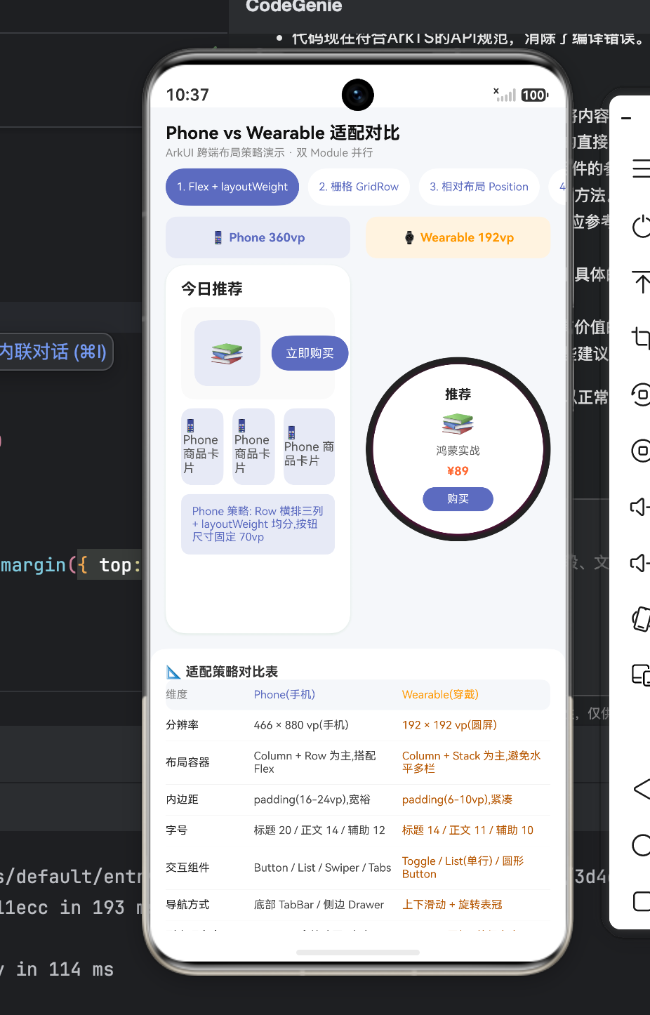
八、 架构师寄语:双端协同的极限与抉择
通过对这五大典型场景的深度源码剖析,我们可以清晰地感受到 HarmonyOS 跨端开发并非简单的“自适应缩放”,而是一场深刻的用户体验重塑。
对于企业级研发团队而言,最佳的实践姿势如下:
- 抽象底层业务库(HAR/HSP):所有关于网络请求、数据存储(Preferences)、蓝牙通信的代码,必须剥离成与 UI 无关的底层模块,确保手机端和手表端能够 100% 完美复用同一套数据逻辑。
- 组件级粗粒度共享,页面级精细化重写:像按钮颜色、进度条、简单文本块这类微观组件,可以通过
@Prop动态传入宽高进行多端复用。但是,对于整个页面级(Page)的骨架,强烈建议在 Phone Module 和 Wearable Module 中分别独立手写build()方法。强行在一个文件里用无穷无尽的if-else去判断当前是不是手表,不仅会导致代码极度臃肿、可读性断崖式下跌,还会严重拖累渲染性能。
智能穿戴设备绝不是智能手机的附属缩小版。它是在用户处于运动、驾驶、或者双手被占用等“微任务(Micro-tasking)”场景下,最闪耀的主角。掌握了 ArkUI 在手机与手表之间的 UI 协同与折中平衡之道,您就能在“全场景智慧生活”的万物互联时代,为用户打磨出跨越物理介质边界的极致体验。

一站式 AI 云服务平台
更多推荐

 0
0 0
0- 0


 已为社区贡献4条内容

所有评论(0)