
《响应式布局与自适应布局在折叠屏电商App中的综合应用》:HarmonyOS ArkUI 跨端流体排版全景解析

文章目录
前言
随着智能手机硬件形态的不断演进,折叠屏设备(Foldables,如华为 Mate X、Pura X Max 系列)已经从极客玩家的尝鲜玩具,正式迈入了大众消费市场。对于电商 App 而言,这既是巨大的商业机遇,也是前所未有的技术挑战。
在传统的直板手机时代,电商商品列表通常采用“双列瀑布流”或“单列大图”的固定排版。然而,当用户将折叠屏手机展开,屏幕可视面积瞬间翻倍,如果 App 仅仅是粗暴地将原本的双列商品横向拉伸,不仅会导致图片严重模糊、信息密度极速下降,更会让用户产生强烈的“大号老人机”的廉价感,严重拖累商品的转化率。
高端精致的电商 App,必须在设备展开的瞬间,完成从“双列”到“四列”甚至“五列”的丝滑重排。这就需要我们深刻理解并综合运用响应式布局(Responsive Layout)与自适应布局(Adaptive Layout)。
在 HarmonyOS 的 ArkUI 声明式框架中,系统为我们提供了 GridRow(响应式栅格)、WaterFlow(瀑布流)以及强大的属性动画引擎。本文将基于一段高度浓缩的 ArkUI 折叠屏电商适配实战源码,为您进行像素级、架构级别的深度拆解。我们将剥开 UI 的表象,深入探究断点引擎的运作机制、瀑布流的动态列数重构,以及如何在物理屏幕折叠/展开的瞬间,实现顺滑如水的空间过渡。
一、 概念厘清:响应式(Responsive)与自适应(Adaptive)的交响乐
在深入代码之前,我们必须纠正业界常见的一个认知误区:很多人将“响应式”和“自适应”混为一谈。
- 响应式布局(Responsive):强调“流体(Fluid)”。元素的大小、间距会随着屏幕宽度的变化而像水一样自然拉伸或挤压。在 ArkUI 中,使用百分比(如
width('100%'))、layoutWeight或1fr都是响应式的体现。 - 自适应布局(Adaptive):强调“断点(Breakpoints)”。当屏幕宽度跨越某个物理阈值时,UI 的宏观结构发生根本性改变。例如,从小屏的 2 列突变为大屏的 4 列,或者底部 TabBar 突变为侧边 Drawer。
在优秀的电商折叠屏应用中,这两者是共存的:利用自适应布局(GridRow 断点)决定当前该显示几列,利用响应式布局(WaterFlow 与 1fr)让列内的商品卡片填满剩余空间。
二、 领域模型驱动:电商商品与断点配置的数据基座
在声明式 UI 中,界面是数据的具象化投影。我们首先构建了支撑整个商品网格的数据模型。
// 1. 商品实体契约
interface Product {
  id: number;
  name: string;
  price: string;
  image: string;
  tag?: string // 可选属性,用于展示"热销"、"新品"等角标
}

// 2. 核心断点配置模型
interface BreakpointConfig {
  name: string;      // 断点代号:sm, md, lg
  columns: string;   // WaterFlow 模板语法:'1fr 1fr'
  label: string;     // UI 展示标签
  cols: number       // 直观列数
}

// 3. 定义三大物理形态的布局策略
const breakpoints: BreakpointConfig[] = [
  { name: 'sm', columns: '1fr 1fr', label: '折叠态 · 2列', cols: 2 },
  { name: 'md', columns: '1fr 1fr 1fr 1fr', label: '展开态 · 4列', cols: 4 },
  { name: 'lg', columns: '1fr 1fr 1fr 1fr 1fr', label: '大屏 · 5列', cols: 5 }
]
底层设计原理解析:
- 数据驱动排版:我们将布局策略(
breakpoints)直接抽象为了数据对象。在columns属性中,我们使用了 ArkUI 瀑布流和网格系统非常经典的fr(fraction,片段)单位。'1fr 1fr'意味着将可用宽度均分为两份;'1fr 1fr 1fr 1fr'则均分为四份。这比写死绝对的像素宽度(如180vp)具有无可比拟的容错率与延展性。 - 形态定义的映射:
sm(Small):代表折叠屏合上时的外屏,或普通直板手机。此时屏幕较窄,2 列是展示商品细节与维持高信息密度的最佳黄金分割。md(Medium):代表折叠屏展开时的内屏,或平板竖屏。物理宽度瞬间增加,此时切换为 4 列,能将商品曝光率提升 100%,极大提高用户的扫视效率。lg(Large):代表平板横屏或未来的 PC 桌面端窗口。此时 5 列能保证卡片不会被过度拉伸导致图片失真。
三、 状态引擎:桥接物理屏幕与逻辑布局
在应用运行时,我们需要一个状态机来捕捉屏幕形态的变化,并将其下发给底层的渲染树。
@Entry
@Component
struct Index {
  // 核心响应式状态变量
  @State currentBreakpoint: string = 'sm'
  @State columnsTemplate: string = breakpoints[0].columns
  @State cols: number = breakpoints[0].cols

  // 状态分发中心:响应断点变更
  private onBreakpointChange(breakpoint: string): void {
    this.currentBreakpoint = breakpoint
    const config: BreakpointConfig | undefined = breakpoints.find(b => b.name === breakpoint)
    if (config) {
      // 触发 UI 重绘的核心锚点
      this.columnsTemplate = config.columns
      this.cols = config.cols
    }
  }
  // ...
}
状态机流转解析:
在这段演示源码中,为了方便在单一虚拟机或预览器中展示效果,作者巧妙地在 UI 顶部预留了横向的按钮组来手动调用 onBreakpointChange 模拟折叠/展开。
但在真实的千万级日活电商生产环境中,开发者绝不需要让用户去点击按钮。你只需要将这个方法绑定到 GridRow 的 onBreakpointChange 回调函数上。当用户双手握住物理设备,掰开折叠屏铰链的那个瞬间,鸿蒙操作系统的底层的 Display Manager 会精准捕获屏幕宽度的突变,自动触发该回调。columnsTemplate 被重新赋值,ArkUI 的 Diff 引擎开始工作,整个商品瀑布流瞬间完成架构重组。
四、 微观视觉重构:高保真商品卡片 (Product Card) 渲染
在电商 App 中,商品卡片(Item Card)是离钱最近的 UI 组件。它的设计必须兼顾极高的性能与极佳的视觉吸引力。
  @Builder
  ProductCard(item: Product): void {
    // 瀑布流专属子容器
    FlowItem() {
      Column() {
        // 1. 媒体与角标层 (Z轴层叠)
        Stack() {
          Image(item.image)
            .width('100%')
            .aspectRatio(1) // 【极其关键】:强制 1:1 正方形比例
            .objectFit(ImageFit.Cover) // 裁切适应,防止图片被挤压变形

          // 营销角标动态挂载
          if (item.tag) {
            Text(item.tag).fontSize(10).fontColor('#FFFFFF')
              .padding({ left: 6, right: 6, top: 2, bottom: 2 })
              .backgroundColor('#FF5722').borderRadius(4)
              // 绝对定位,吸附于左上角
              .position({ top: 6, left: 6 })
          }
        }
        .width('100%').borderRadius(10) // 卡片级圆角包裹

        // 2. 核心信息信息层
        Column() {
          // 商品名称:支持最多2行,溢出显示省略号
          Text(item.name).fontSize(11).fontColor('#222').width('100%')
            .maxLines(2).textOverflow({ overflow: TextOverflow.Ellipsis })

          // 视觉锚点:营销价格
          Text(item.price).fontSize(13).fontColor('#FF5722')
            .fontWeight(FontWeight.Bold).width('100%').margin({ top: 4 })
        }
        .width('100%').padding({ top: 8 })
      }
      .width('100%').padding(6)

      // 【高能魔法:空间折叠动画】
      .animation({
        duration: 300,
        curve: Curve.FastOutSlowIn,
        iterations: 1,
        playMode: PlayMode.Normal
      })
    }
  }
电商级 UI/UX 深度解密:
aspectRatio(1)与ImageFit.Cover的铁律:在瀑布流中,图片的尺寸极其容易失控。通过aspectRatio(1)强制图片的容器为完美正方形,配合Cover模式,无论在 2 列、4 列还是 5 列状态下,图片永远不会因为宽度的突然拉伸而变得扁平,保证了极高的商品陈列整齐度。Stack+position构建沉浸式角标:对于“热销”、“限时折扣”等营销 Tag,最忌讳的是把它作为单独的 DOM 节点挤占文字空间。使用Stack结合绝对定位position,让红色角标悬浮在图片内部的左上角,这是现代电商降低视觉噪音、提高有效信息密度的标准做法。.animation()的丝滑补间:这是全篇最不可或缺的一行代码。当折叠屏展开,列数从 2 列变为 4 列时,卡片的宽度会被瞬间压缩一半,物理位置也会发生跨越式的重排。如果此时没有过渡动画,用户的视觉焦点会彻底丢失,产生严重的眩晕感。我们在最外层挂载.animation()属性动画引擎,配合Curve.FastOutSlowIn(快出慢入物理曲线),ArkUI 会接管布局变化,在 300 毫秒内像变魔术一样,让商品卡片平滑地滑动并缩放至新的物理位置。
五、 宏观骨架搭建:GridRow 与 WaterFlow 的完美协同
真正的核心架构,在于如何将自适应的骨架(GridRow)与流体的内容(WaterFlow)嵌合在一起。
      // 1. 定义自适应骨架引擎
      GridRow({
        // 在不同断点下,整个栅格系统划分为多少块最小单元
        columns: { sm: 2, md: 4, lg: 5 },
        // 定义断点物理阈值:600vp(折叠屏展开临界点), 900vp(大屏临界点)
        breakpoints: { value: ['600vp', '900vp'] }
      }) {
        // 2. 占满全部可用空间
        GridCol() {
          // 3. 瀑布流内容引擎
          WaterFlow() {
            ForEach(products, (item: Product) => {
              this.ProductCard(item)
            })
          }
          // 动态注入列数模板
          .columnsTemplate(this.columnsTemplate)
          .width('100%')
        }
      }
      .layoutWeight(1).width('100%').padding({ left: 10, right: 10, top: 10 })
架构师视角的底层逻辑:
在 ArkUI 中,GridRow 本质上是一个隐形的“断点探测器与响应式调度中心”。
breakpoints: { value: ['600vp', '900vp'] }:这行代码告诉鸿蒙操作系统:“请监听屏幕物理宽度。当宽度在 0~600vp 之间时,当前状态为sm;600vp~900vp 之间为md;大于 900vp 为lg”。WaterFlow(瀑布流):为什么不用普通的Grid网格?在真实的电商应用中,虽然本例中使用了 1:1 的正方形图片,但商品卡片底部的标题可能有一行,也可能有两行,甚至还有额外的促销标签。这会导致同一行的商品卡片高度不一。如果使用传统的Grid,整行的高度会被强行统一,留下大量丑陋的空白。而WaterFlow能够自动识别不同高度的FlowItem,并将其像俄罗斯方块一样紧凑地向上吸附交错排列,极大地提升了屏幕空间的利用率。.columnsTemplate(this.columnsTemplate):我们将上面状态机中计算出的'1fr 1fr'甚至'1fr 1fr 1fr 1fr'直接注入瀑布流容器。当属性改变时,底层的排版引擎会以极高的帧率重构整个网格矩阵。
完整代码
interface Product { id: number; name: string; price: string; image: string; tag?: string }
interface BreakpointConfig { name: string; columns: string; label: string; cols: number }
const breakpoints: BreakpointConfig[] = [
{ name: 'sm', columns: '1fr 1fr', label: '折叠态 · 2列', cols: 2 },
{ name: 'md', columns: '1fr 1fr 1fr 1fr', label: '展开态 · 4列', cols: 4 },
{ name: 'lg', columns: '1fr 1fr 1fr 1fr 1fr', label: '大屏 · 5列', cols: 5 }
]
const products: Product[] = [
{ id: 1, name: '无线蓝牙耳机 Pro', price: '¥299', image: 'https://trae-api-cn.mchost.guru/api/ide/v1/text_to_image?prompt=modern%20wireless%20bluetooth%20earbuds%20white%20background%20product%20photo&image_size=square', tag: '热销' },
{ id: 2, name: '智能手表运动版', price: '¥1299', image: 'https://trae-api-cn.mchost.guru/api/ide/v1/text_to_image?prompt=smart%20watch%20fitness%20tracker%20black%20white%20background%20product%20photo&image_size=square', tag: '新品' },
{ id: 3, name: '便携充电宝 20000mAh', price: '¥159', image: 'https://trae-api-cn.mchost.guru/api/ide/v1/text_to_image?prompt=portable%20power%20bank%2020000mAh%20white%20background%20product%20photo&image_size=square' },
{ id: 4, name: '机械键盘青轴', price: '¥499', image: 'https://trae-api-cn.mchost.guru/api/ide/v1/text_to_image?prompt=mechanical%20keyboard%20RGB%20lights%20white%20background%20product%20photo&image_size=square', tag: '限时折扣' },
{ id: 5, name: '无线鼠标静音版', price: '¥89', image: 'https://trae-api-cn.mchost.guru/api/ide/v1/text_to_image?prompt=wireless%20silent%20mouse%20ergonomic%20white%20background%20product%20photo&image_size=square' },
{ id: 6, name: '平板保护套', price: '¥69', image: 'https://trae-api-cn.mchost.guru/api/ide/v1/text_to_image?prompt=tablet%20case%20protective%20cover%20minimalist%20white%20background%20product%20photo&image_size=square' },
{ id: 7, name: 'USB-C 数据线', price: '¥39', image: 'https://trae-api-cn.mchost.guru/api/ide/v1/text_to_image?prompt=USB-C%20charging%20cable%20braided%20white%20background%20product%20photo&image_size=square' },
{ id: 8, name: '手机支架桌面版', price: '¥45', image: 'https://trae-api-cn.mchost.guru/api/ide/v1/text_to_image?prompt=phone%20stand%20holder%20desk%20mount%20white%20background%20product%20photo&image_size=square' },
{ id: 9, name: '降噪耳机头戴式', price: '¥899', image: 'https://trae-api-cn.mchost.guru/api/ide/v1/text_to_image?prompt=over-ear%20noise%20canceling%20headphones%20black%20white%20background%20product%20photo&image_size=square', tag: '精选' },
{ id: 10, name: '便携蓝牙音箱', price: '¥199', image: 'https://trae-api-cn.mchost.guru/api/ide/v1/text_to_image?prompt=portable%20bluetooth%20speaker%20compact%20white%20background%20product%20photo&image_size=square' },
{ id: 11, name: '无线充电器', price: '¥79', image: 'https://trae-api-cn.mchost.guru/api/ide/v1/text_to_image?prompt=wireless%20charger%20pad%20white%20minimalist%20white%20background%20product%20photo&image_size=square' },
{ id: 12, name: '笔记本散热器', price: '¥99', image: 'https://trae-api-cn.mchost.guru/api/ide/v1/text_to_image?prompt=laptop%20cooling%20pad%20fan%20white%20background%20product%20photo&image_size=square' },
{ id: 13, name: 'HDMI 转换线', price: '¥59', image: 'https://trae-api-cn.mchost.guru/api/ide/v1/text_to_image?prompt=HDMI%20cable%20adapter%20converter%20white%20background%20product%20photo&image_size=square' },
{ id: 14, name: '智能手环', price: '¥199', image: 'https://trae-api-cn.mchost.guru/api/ide/v1/text_to_image?prompt=fitness%20band%20smart%20bracelet%20white%20background%20product%20photo&image_size=square', tag: '运动' },
{ id: 15, name: '收纳包数码版', price: '¥89', image: 'https://trae-api-cn.mchost.guru/api/ide/v1/text_to_image?prompt=tech%20organizer%20bag%20pouch%20gray%20white%20background%20product%20photo&image_size=square' }
]
struct Index {
currentBreakpoint: string = 'sm'
columnsTemplate: string = breakpoints[0].columns
cols: number = breakpoints[0].cols
private onBreakpointChange(breakpoint: string): void {
this.currentBreakpoint = breakpoint
const config: BreakpointConfig | undefined = breakpoints.find(b => b.name === breakpoint)
if (config) {
this.columnsTemplate = config.columns
this.cols = config.cols
}
}
private getColumnConfig(): BreakpointConfig | undefined {
return breakpoints.find(b => b.name === this.currentBreakpoint)
}
ProductCard(item: Product): void {
FlowItem() {
Column() {
Stack() {
Image(item.image)
.width('100%').aspectRatio(1).objectFit(ImageFit.Cover)
if (item.tag) {
Text(item.tag).fontSize(10).fontColor('#FFFFFF').padding({ left: 6, right: 6, top: 2, bottom: 2 })
.backgroundColor('#FF5722').borderRadius(4).position({ top: 6, left: 6 })
}
}
.width('100%').borderRadius(10)
Column() {
Text(item.name).fontSize(11).fontColor('#222').width('100%').maxLines(2).textOverflow({ overflow: TextOverflow.Ellipsis })
Text(item.price).fontSize(13).fontColor('#FF5722').fontWeight(FontWeight.Bold).width('100%').margin({ top: 4 })
}
.width('100%').padding({ top: 8 })
}
.width('100%').padding(6)
.animation({
duration: 300,
curve: Curve.FastOutSlowIn,
iterations: 1,
playMode: PlayMode.Normal
})
}
}
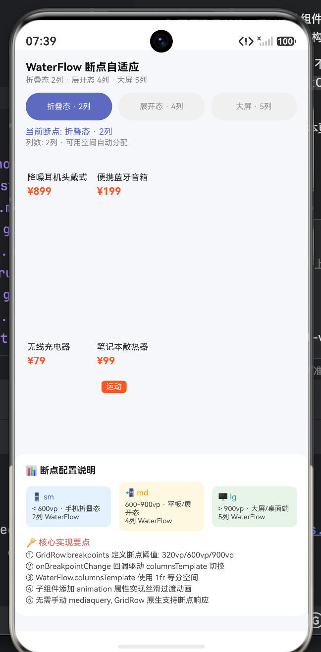
build() {
Column() {
Row() {
Column() {
Text('WaterFlow 断点自适应').fontSize(14).fontColor('#111').fontWeight(FontWeight.Bold)
Text('折叠态 2列 · 展开态 4列 · 大屏 5列').fontSize(10).fontColor('#888').margin({ top: 3 })
}
.layoutWeight(1).alignItems(HorizontalAlign.Start)
}
.width('100%').padding({ left: 14, right: 14, top: 14, bottom: 10 })
Row({ space: 8 }) {
ForEach(breakpoints, (bp: BreakpointConfig) => {
Column() {
Text(bp.label).fontSize(10).fontColor(this.currentBreakpoint === bp.name ? '#FFFFFF' : '#888')
}
.layoutWeight(1).height(36).backgroundColor(this.currentBreakpoint === bp.name ? '#5C6BC0' : '#F0F0F0').borderRadius(18)
.alignItems(HorizontalAlign.Center).justifyContent(FlexAlign.Center)
})
}
.width('100%').padding({ left: 14, right: 14 })
Column() {
Text('当前断点: ' + this.getColumnConfig()?.label).fontSize(11).fontColor('#5C6BC0').width('100%')
Text('列数: ' + this.cols + '列 · 可用空间自动分配').fontSize(10).fontColor('#888').width('100%').margin({ top: 2 })
}
.width('100%').padding({ left: 14, right: 14, top: 8 })
GridRow({
columns: { sm: 2, md: 4, lg: 5 },
breakpoints: { value: ['600vp', '900vp'] }
}) {
GridCol() {
WaterFlow() {
ForEach(products, (item: Product) => {
this.ProductCard(item)
})
}
.columnsTemplate(this.columnsTemplate)
.width('100%')
}
}
.layoutWeight(1).width('100%').padding({ left: 10, right: 10, top: 10 })
Column() {
Text('📊 断点配置说明').fontSize(12).fontColor('#222').fontWeight(FontWeight.Bold).width('100%')
Row({ space: 10 }) {
Column() {
Text('📱 sm').fontSize(10).fontColor('#5C6BC0').width('100%')
Text('< 600vp · 手机折叠态').fontSize(9).fontColor('#444').width('100%').margin({ top: 4 })
Text('2列 WaterFlow').fontSize(9).fontColor('#444').width('100%')
}
.layoutWeight(1).padding(8).backgroundColor('#E3F2FD').borderRadius(8)
Column() {
Text('📲 md').fontSize(10).fontColor('#FF9800').width('100%')
Text('600-900vp · 平板/展开态').fontSize(9).fontColor('#444').width('100%').margin({ top: 4 })
Text('4列 WaterFlow').fontSize(9).fontColor('#444').width('100%')
}
.layoutWeight(1).padding(8).backgroundColor('#FFF8E1').borderRadius(8)
Column() {
Text('🖥 lg').fontSize(10).fontColor('#26A69A').width('100%')
Text('> 900vp · 大屏/桌面端').fontSize(9).fontColor('#444').width('100%').margin({ top: 4 })
Text('5列 WaterFlow').fontSize(9).fontColor('#444').width('100%')
}
.layoutWeight(1).padding(8).backgroundColor('#E8F5E9').borderRadius(8)
}
.width('100%').margin({ top: 8 })
Text('').fontSize(8).width('100%').margin({ top: 8 })
Text('🔑 核心实现要点').fontSize(11).fontColor('#EF5350').width('100%')
Text('① GridRow.breakpoints 定义断点阈值: 320vp/600vp/900vp').fontSize(10).fontColor('#444').width('100%').margin({ top: 4 })
Text('② onBreakpointChange 回调驱动 columnsTemplate 切换').fontSize(10).fontColor('#444').width('100%').margin({ top: 3 })
Text('③ WaterFlow.columnsTemplate 使用 1fr 等分空间').fontSize(10).fontColor('#444').width('100%').margin({ top: 3 })
Text('④ 子组件添加 animation 属性实现丝滑过渡动画').fontSize(10).fontColor('#444').width('100%').margin({ top: 3 })
Text('⑤ 无需手动 mediaquery, GridRow 原生支持断点响应').fontSize(10).fontColor('#444').width('100%').margin({ top: 3 })
}
.width('100%').padding(14).backgroundColor('#FFFFFF').borderRadius(12).margin({ left: 10, right: 10, top: 10, bottom: 20 })
}
.width('100%').height('100%').backgroundColor('#F5F7FA')
}
}
六、 核心参数与 HarmonyOS 响应式组件速查表
为了帮助大家快速将这段架构应用到生产环境,特将 HarmonyOS 响应式系统的核心 API 整理如下:
表 1:自适应栅格 GridRow 断点参数精解
| 断点标识 | 默认阈值区间 | 代表性物理设备形态 | 电商布局策略最佳实践 |
|---|---|---|---|
xs |
< 320vp | 智能手表、极窄外屏 | 单列大图。保持组件宽度撑满,极度精简次要文字信息。 |
sm |
320vp - 600vp | 传统直板手机竖屏、折叠屏闭合态 | 2 列瀑布流。这是目前主流电商 C 端 App 最核心的利润基本盘。 |
md |
600vp - 840vp | 折叠屏展开内屏、平板竖屏 | 3 列 或 4 列。推荐 4 列排版,彻底释放折叠屏宽阔视野,提升首屏曝光率。 |
lg |
> 840vp | 平板横屏、智慧屏、PC 桌面端 | 5 列 或左侧 Drawer 导航 + 右侧 4 列。需注意控制最大宽度,防止图片过大导致分辨率失真。 |
表 2:WaterFlow (瀑布流) 核心排版属性指南
| 属性名称 | 类型 / 语法 | 布局控制效果 |
|---|---|---|
columnsTemplate |
string (如 '1fr 1fr') |
定义列的数量与宽度配比。fr 表示剩余空间分配。如果写 '1fr 2fr',则右列宽度是左列的两倍。 |
columnsGap |
Length (如 10vp) |
定义垂直列与列之间的横向间距。 |
rowsGap |
Length (如 12vp) |
定义瀑布流中,上下相邻的两个商品卡片之间的垂直间距。 |
layoutDirection |
FlexDirection | FlexDirection.Column(默认,自上而下);极少数场景可用横向瀑布流。 |
七、 生产环境实战:不可忽视的深坑与优化指南
代码中的架构虽已极为精妙,但在面对真实世界中数以百万计的商品流时,架构师必须额外关注以下性能与体验陷阱:
- 图片加载的内存灾难(Lazy Loading Dangers)
折叠屏展开为 4 列后,屏幕内需要同时加载的图片数量翻倍。如果直接使用ForEach全量渲染几百个商品,应用会瞬间触发 OOM(Out Of Memory)崩溃。
终极解法:必须将ForEach替换为LazyForEach。结合自研的IDataSource数据源,ArkUI 的瀑布流引擎会进行严格的节点复用和视图回收(View Recycling)。屏幕外看不见的商品卡片将被销毁,极大地释放了系统内存。 - 动画冲突与掉帧风险
在我们为卡片添加.animation()以实现丝滑折叠过渡的同时,如果此时用户恰好在疯狂上下滑动瀑布流,布局重排动画与滚动惯性动画会发生严重的系统级计算冲突,导致画面撕裂。
架构建议:监听GridRow断点变化时,短期锁死(Disable)瀑布流的滚动响应,待 300ms 过渡动画结束后,再恢复用户的滚动权限。 - 大屏图片的降维打击
折叠屏展开后,卡片虽然变多,但单张卡片的绝对宽度反而可能比手机竖屏时要小。如果此时依然请求服务端下发 1080P 的高清商品主图,那是极其浪费带宽且拖累解码速度的。
网络优化策略:向后端请求图片时,前端必须通过当前的currentBreakpoint状态,动态拼接图片的 CDN 裁剪参数(例如:?x-oss-process=image/resize,w_300)。在 4 列模式下主动请求极小尺寸的缩略图,将冷启动速度拉升至极致。
结语:从“一块屏幕”到“无界视界”
折叠屏的出现,打破了移动互联网十年来固化的长方形画框,它要求开发者具备在不同空间维度中自由穿梭的架构能力。
通过深入理解 ArkUI 的 GridRow 栅格机制、灵活调配 WaterFlow 瀑布引擎、并在底层敷上优雅的属性动画,我们能够用一套代码,完美应对从直板手机到巨幕折叠屏的所有形态跃迁。掌握这种响应式与自适应交织的高阶布局哲学,不仅是对业务转化率的最高负责,更是您在 HarmonyOS 全场景开发时代中,最闪耀的技术护城河。

一站式 AI 云服务平台
更多推荐


 1
1 0
0- 0


 已为社区贡献7条内容

所有评论(0)