
微前端大仓中的跨技术栈设计系统治理:基于 Style Dictionary 的统一 Token 编译
·
微前端大仓中的跨技术栈设计系统治理:基于 Style Dictionary 的统一 Token 编译
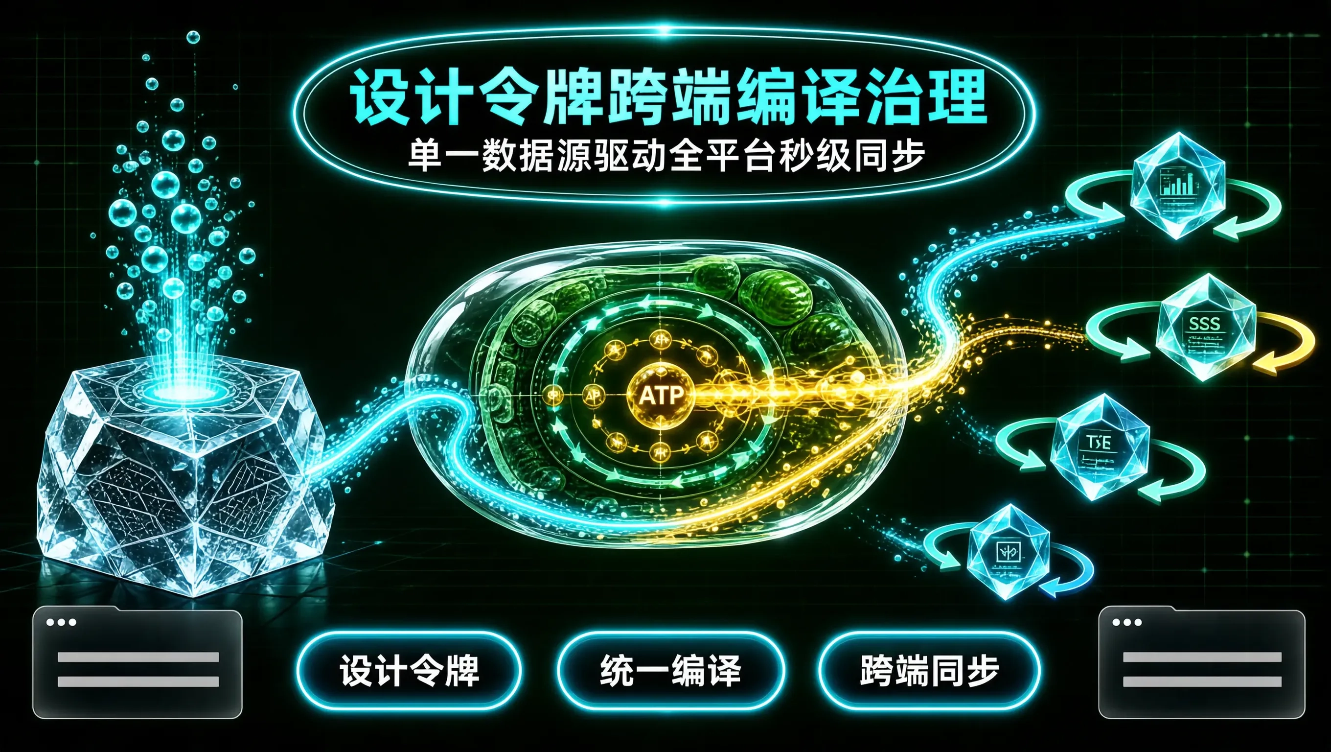
在大型跨端、跨技术栈的企业级微前端与 Monorepo 代码大仓中,前端与 UI/UX 设计师之间长期存在着一条充满低效与摩擦的“沟通鸿沟”:
- UI 设计师在 Figma 中调整了品牌主题色(例如从
#06B6D4微调为#0891B2)、或者统一规范了卡片圆角为16px; - 前端团队面临的现实却是:React 子应用在用 Tailwind CSS、Vue 3 子应用在用 SCSS 变量、移动端混合开发在用 TypeScript 常量、而 iOS 原生端在用 Swift 枚举;
- 5 个团队必须分别在各自的项目里手动查找替换几十处色值,耗时数天且极易遗漏,导致同一个平台在不同子应用和移动端呈现出五花八门、参差不齐的视觉色差。
将 设计资产代码化(Design Tokens as Code) 与 自动化多目标编译器(Style Dictionary) 深度整合,是现代前端工程治理跨端设计系统的终极工业级标准。
通过建立单一真实数据源(Single Source of Truth: tokens.json),我们能够在设计师更新 Figma 的瞬间,通过 CI 流水线一键自动化编译产出针对 React (Tailwind/CSS Variables)、Vue (SCSS)、TypeScript (强类型对象) 以及原生移动端的全套标准资产代码。
Style Dictionary 跨端多目标 Token 编译流水线拓扑
[UI/UX 设计师在 Figma 中更新设计规范 (Design Tokens)]
                          │
                          ▼ (通过 Figma Token 插件一键导出)
┌─────────────────────────────────────────────────────────────┐
│ 【单一真实数据源 (Single Source of Truth): tokens.json】    │
│   - 颜色 Token: `{ "color": { "brand": { "primary": { "value": "#06B6D4" } } } }`│
│   - 间距 Token: `{ "spacing": { "card": { "radius": { "value": "16px" } } } }` │
└─────────────────────────┬───────────────────────────────────┘
                          │
                          ▼ (Style Dictionary 自动化编译转换器)
┌─────────────────────────────────────────────────────────────┐
│ 【多目标平台自动化转译分发矩阵 (Cross-Platform Targets)】   │
│                                                             │
│   ├─► [Target 1: Web CSS 变量] ────► `:root { --color-brand-primary: #06B6D4; }`
│   ├─► [Target 2: Tailwind Preset] ──► `theme: { extend: { colors: { brand: ... } } }`
│   ├─► [Target 3: SCSS 变量库] ─────► `$color-brand-primary: #06B6D4;`
│   ├─► [Target 4: TS 强类型枚举] ───► `export const BrandColor = { PRIMARY: '#06B6D4' } as const`
│   └─► [Target 5: iOS Swift 资产] ──► `public static let brandPrimary = UIColor(...)`
└─────────────────────────────────────────────────────────────┘
  ==> 全公司 50+ 个微前端子应用与移动端秒级同步,视觉资产 100% 绝对一致!
核心配置一:定义基础 Design Tokens 规范文件(tokens/brand.json)
在代码大仓公共设计包 @company/design-tokens 中维护纯 JSON 格式的设计令牌:
{
  "color": {
    "brand": {
      "primary": { "value": "#06B6D4", "comment": "品牌核心青蓝主色" },
      "accent": { "value": "#F43F5E", "comment": "电音摇滚高光玫红" },
      "background": { "value": "#030712", "comment": "深邃暗黑背景底色" }
    },
    "neutral": {
      "surface": { "value": "#0F172A", "comment": "卡片浮层深色背景" },
      "border": { "value": "#1E293B", "comment": "微弱边框分割线" }
    }
  },
  "border": {
    "radius": {
      "sm": { "value": "8px" },
      "md": { "value": "16px" },
      "lg": { "value": "24px" }
    }
  },
  "spacing": {
    "container": { "value": "24px" }
  }
}
核心实现二:生产级 style-dictionary.config.js 多端多格式编译配置
// style-dictionary.config.js
module.exports = {
  source: ['tokens/**/*.json'],
  platforms: {
    // 1. Web 标准 CSS 变量平台 (供 React / Vue 微前端基座直接加载)
    css: {
      transformGroup: 'css',
      buildPath: 'dist/css/',
      files: [
        {
          destination: 'variables.css',
          format: 'css/variables',
          options: {
            outputReferences: true,
          },
        },
      ],
    },

    // 2. SCSS 平台 (供传统 Vue 3 / 组件库引用)
    scss: {
      transformGroup: 'scss',
      buildPath: 'dist/scss/',
      files: [
        {
          destination: '_tokens.scss',
          format: 'scss/variables',
        },
      ],
    },

    // 3. TypeScript 强类型常量定义 (100% IDE 智能感知与类型推导)
    typescript: {
      transformGroup: 'js',
      buildPath: 'dist/ts/',
      files: [
        {
          destination: 'tokens.d.ts',
          format: 'typescript/es6-declarations',
        },
        {
          destination: 'tokens.js',
          format: 'javascript/es6',
        },
      ],
    },

    // 4. Tailwind CSS 预设配置预编译 (让所有子应用共用同一个 Tailwind Preset)
    tailwind: {
      transformGroup: 'js',
      buildPath: 'dist/tailwind/',
      files: [
        {
          destination: 'tailwind-preset.js',
          format: 'javascript/module-flat',
        },
      ],
    },
  },
};
在微前端各业务子应用中的极简消费实践
1. React 子应用消费编译产出的 Tailwind Preset:
// order-remote-app/tailwind.config.js
const companyPreset = require('@company/design-tokens/dist/tailwind/tailwind-preset.js');

module.exports = {
  presets: [companyPreset], // 继承全企业统一 Design Tokens
  content: ['./src/**/*.{tsx,ts}'],
  theme: {
    extend: {},
  },
};
2. Vue 3 子应用消费 SCSS 变量与 TS 强类型:
<!-- product-remote-app/src/components/DrumCard.vue -->
<template>
  <div class="drum-card">
    <h3 class="title">808 架子鼓配件</h3>
  </div>
</template>

<script setup lang="ts">
import { colorBrandPrimary } from '@company/design-tokens/dist/ts/tokens';
console.log('当前品牌主色常量:', colorBrandPrimary); // '#06B6D4'
</script>

<style scoped lang="scss">
@import '@company/design-tokens/dist/scss/_tokens.scss';

.drum-card {
  background-color: $color-neutral-surface;
  border: 1px solid $color-neutral-border;
  border-radius: $border-radius-md; // 16px
  padding: $spacing-container;
}
</style>
设计系统 Token 自动化编译治理成效
- 彻底终结跨端色差与设计不一致:全公司 50+ 个微前端子应用、H5 移动端与客户端共享唯一的
tokens.json编译源头,从根源上杜绝了人工硬编码色值。 - 主题变更上线效率从 3 天缩短至 1 分钟:品牌升级或节日换肤时,只需修改一次 JSON Token,CI 自动触发编译并发布新版本 NPM 包,全站秒级换肤。
- 消除跨技术栈认知壁垒:无论是写 Tailwind 的 React 开发者、写 SCSS 的 Vue 开发者、还是写 Swift 的 iOS 开发者,都在使用完全同一套语义化设计令牌。

一站式 AI 云服务平台
更多推荐


 0
0 0
0- 0


 已为社区贡献2条内容

所有评论(0)